Mobile Blogging

I have a mobile device with me at all time and a computer only some of the time. I therefore thought I should try out writing and uploading blog posts remotely. I'm writing this post using my iPod Touch while I'm on vacation.

I'm finding that I'm doing more and more using a mobile device. I do the majority of my tweeting, a significant amount of my e-mail, as well as rss reading, facebooking, and even checking my Google Analytics on a mobile device. So, blogging makes sense too.

I'd love to hear about your experiences in using mobile platforms via the commenting mechansim below.

Mobile & Real-Team Web Innovation Podcast

Joining me on this episode are Val Fox (Director, Innovative Technology Solutions, Ryerson University), Keith Instone (Information Architecture Lead, IBM CIO’s Office, IBM.com), Eliane Tozman (User Interface Designer, IBM Media Design Studio), and our newest member of the panel Jay Trimble (Group Lead for the User Centered Technology Group, NASA Ames Research Center). The panel discusses the Palm Pre and Palm's new WebOS, an update on the Usability Professionals Association (UPA) including an innovative perspective on design called Evil by Design, a summary of the trend toward what has recently called the real-time web including design features of Google Wave and recent experiences regarding Twitter. The interesting website of the month that was discussed is spezify.com and the community news concerned the IxDA organization. The Mozilla Labs design challenge together with IxDA was also discussed.

As always, please use the comment capability of this blog to provide any feedback you may have on this podcast episode.

Producing a Podcast - Part I

I've been creating podcasts for about a year and a half and during that time have been asked on a regular basis how I go about doing it. I've provided those who asked the details of whatever setup and procedure I used at the time. I've regularly improved upon the equipment, software, and settings. However, I'm pretty well satisfied with the setup that I have now so thought I'd share what I do and what I use here; that way, I simply have to point people here for all the details.

The most important aspect of doing a podcast is the content. The subject of the podcast series should be something that you know well and are passionate about. You'll be spending a lot of time on it and will need to produce episodes on a fairly steady basis so make sure that you choose your subject area carefully. It should also be a subject that others are interested in and that there aren't hundreds of podcasts on already. You can check what podcasts are available on various subjects by doing searches in the iTunes store. You should plan on creating a podcast episode ideally on a weekly basis but every few weeks is usually acceptable too. Listeners start to develop an expectation of receiving your episodes at a particular cadence so you should try to stick to a steady schedule of delivery. There are times when get out of the regular rhythm but then just get back to it when you can. I was ill recently, for example, and then experienced laryngitis for weeks afterward which prevented me from recording episodes (having a voice is rather important in podcasting). I've heard that 30 minutes is the ideal length of a podcast although an hour or longer may be appropriate especially given panel type formats. A microphone is the most important piece of equipment you'll need. I use an Audio-Technica AT2020 microphone. It is what is referred to as a large diaphragm condenser microphone. It has great sound but you need to also use a pop filter with it (to prevent an explosive sound when you say the letters 'p' and 't'). I use an Apex pop filter. I have both attached to a floor mounted microphone stand that doesn't touch any other surface such as the desk to prevent the picking up of any extraneous noise. I record in a room with broadloom and make sure that anything else that can make a noice isn't in the room or within earshot (even a cellphone on vibrate will be picked up by the microphone). I don't use a script but do make notes prior to the recording, the quotes and top 10 lists in the case of my Life Habits podcast and the list of articles and their links in the case of my UXDesignCast podcast).

Given the amount of material to cover, I'll divide this post into a Part I and a Part II. I'll address the actual recording and post-production software, settings, filters, uploading, and posting in Part II. As usual, feel free to contribute any of your own thoughts, experiences, and/or questions using the commenting capability of this blog.

Dynamic Forms, Survey Construction, & Design Inspiration Podcast

Here's episode #26 in my UXDesignCast podcast series. Joining me on this episode are Julie Santilli (IBM Visual Design Community and Tools Lead ), David Schwartz (IBM UI Architecture, Patterns, & Assets Lead), and Bob Jones (IBM User Experience Community & Tools Strategy Lead). The episode provides advice on designing dynamic forms, on constructing effective surveys, and discusses design quotes and recommended reading that provide design insight, advice, and inspiration.


As always, please use the comment capability of this blog to provide any feedback you may have on this podcast episode.

Influential Books on Design

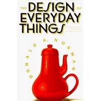
I've been interested for some time in getting other people's perspectives on a number of topics but most recently on the topic of the most influential books on design. So, I asked the followers of my @ibmdesign and @karelvredenburg Twitter accounts the question, "What's the most influential book you've read on design that you'd recommend to others?" I received a number of really good responses so thought I'd share them here. I've decided to include the additional words people used in describing their books. It is interesting to note that five people mentioned books by Donald Norman with the first four recommending "The Design of Everyday Things" and the fifth recommending his more recent "Emotional Design". The rest of the list includes some pretty interesting books some of which I know I haven't read but now will.


  • Donald Norman's "The Design of Everyday Things".
  • "The Design of Everyday Things" by Donald Norman, perhaps the best and most foundational design book.
  • I think Don Norman's "Design of Everyday Things" is a must-read for anyone who designs anything!
  • "Design of Everyday Things"
  • Most influential book: "Emotional Design" by Donald Norman
  • "Set Phasers on Stun" has great case studies of design gone awry.
  • "Dreaming in code" is an interesting guide to software development.
  • The most influential book on design that I have read is "Goodnight Moon" by Margaret Wise Brown. The audience is enormous.
  • "Computers and democracy: a scandinavian challenge" (1987) - first major participatory design publication in english
  • "Dont make me think" is the best design book. At least for me. Principals discussed applied any where.
  • "Now You See It: Simple Visualization Techniques for Quantitative Analysis" by Stephen Few
  • Jeff Johnson's "GUI Bloopers" is the most practical useable desktop reference for companies that don't have standards or UX staff.
  • "The Illusion of Life"; "Design is multidisciplinary", so I don't think we've only 1 most influential book
  • "Sketching User Experiences"
  • "Reflective Practitioner"
  • "A primer of visual literacy"

If you have any books to add to the list or have any comments on the books already listed, please leave a comment below.


Innovation & Design Balance Podcast

Here's episode #25 in my UXDesignCast podcast series. I use a number of different formats in the series including interviews with design leaders of companies across the industry, education sessions, interviews with IBM design teams, and panel discussions. The latest session is a panel format and included panelists Val Fox (Director, Innovative Technology Solutions, Ryerson University), Keith Instone (Information Architecture Lead, IBM CIO's Office, IBM.com), and Eliane Tozman (User Interface Designer, IBM Media Design Studio). In this episode, the panel discusses the Sixth Sense research project, the future of internet search, data-driven design, and what's messing up our UIs (see previous post on this blog).

I recorded this podcast some weeks ago but we had so many technical difficulties with the recording (one panelist didn't have the regular microphone, one didn't have mute working yielding huge echoes, another had a phone ring, and other interruptions) that it took until now to provide an edited version of it. I'd appreciate any comments you may have on it using the regular commenting mechanism.

Twitter Insights


Who would have thought that an application that provided users the ability to input 140 characters of text, have others see it, and be able to see what others write would have become such a success. I've pointed out previously in this blog that I attribute the success of Twitter to the ability to connect with other human beings very efficiently with a minimum of technology in between.

There is a lot we can learn from this phenomenon if we collect and analyze relevant information. I did that via my two Twitter accounts (@ibmdesign and @karelvredenburg) and a polling tool. I've summarized below some of the key findings.

Twitter Use:
A total of 68% of followers have Twitter visible to them most of the day. That's a lot of people keeping track of what is on Twitter for a good portion of the day. Interestingly, Twitterers are not the same as Facebookers. Followers reported using Twitter 80% of the time and Facebook 20% but when I polled my Facebook friends the opposite was true.

Electronic Communication:
Followers responded that 65.7% of the time they interact with others during a typical day is via electronic means. Of course, this isn't just Twitter but is still astounding that two out of every three interactions people have during a typical day are via electronic means and only one out of the three is face-to-face in person communication.

Percent of Tweets Read:
You wonder what percentage of tweets people actually read on Twitter. I asked that too. Followers reported reading 47% of tweets on average but there was a low group which read 5% and high group which read 90%. The low group typically followed a lot of people making it difficult to read a significant proportion of the tweets coming through.

Website or Clients:
On average, users reported accessing the twitter.com site only 7.6% of the time they use Twitter. The vast majority use desktop or mobile Twitter clients. The percentage is interesting because the only statistics that are ever provided for the total number of Twitter users are those of the number of people who use the Twitter.com site. If the 7.6% is at all in the ball-park, this suggests that the total number of users of Twitter exceeds that of Facebook. It would seem possible to accurately count the total number of users since the source client information is included in each tweet but nobody to my knowledge has reported those numbers.

Time to Start Tweeting:
A recent report questioned whether people who join Twitter are serious about using it since it appeared that 60% didn't continue tweeting for the first month. I ran a poll on this one and found that 33% started reading and tweeting immediately, 18% took a week to start, 14% took more than a month, 21% took several months, and 11% took more than a year before that started. I'm actually in the several months group myself. It took me a while to figure Twitter out and friends of mine have the same experience. From these data, it would appear that 49% of people do not tweet during the first month that they've signed up for Twitter but they do after a month or much later. This itself is interesting. While the basic concepts behind Twitter is fairly straight-forward, the actual use if it with all of its conventions isn't.

Conventions:
In a previous post on this blog I wrote the Twitter Authoring Guidelines to help people getting started with Twitter. I'd suggest that anyone still unclear about aspects of the Twitterversse to read that post. It is interesting that most of the conventions in Twitter simply involved someone starting to use a particular practice and then others following their lead. After that, the conventions are incorporated into the various Twitter clients. I've been involved with an effort to improve the design of one of the most important elements of Twitter--the retweet. Most people use the standard "RT @name" to retweet content that someone else has written. The assumption is that this format indicates attribution of the source but virtually no change in the content. Another format "via @name" is supposed to be for retweeting with paraphasing or additional content. Everyone is aware of the former format but fewer are aware of the latter one. One of my followers proposed a new much more efficient format "~@name" which takes one in the place of three or four characters of the precious 140. It is also quite simple and elegant. Of course, I ran a poll on this too and the results showed that 69% of preferred to use the "~@name" format in place of at least some of the other formats. A full 37% want to replace both other retweeting formats with the tilde, 17% think that only the RT format should be replaced, and 14% believe that tilde should replace the "via" format. I'm now using "~@name" for all of my retweeting and encourage you to do as well.

I'm quite amazed at the ability to very quickly collect this type of information using Twitter itself. Of course, it is simply self-report and thus doesn't necessarily reflect reality perfectly. However, I believe this information provides interesting insights into key aspects of the Twitterverse. As always, I'd appreciate any thoughts you may have on any of this by using the commenting feature of this blog.

Design Mentoring

I've served as a mentor to many people over my career and have also learned a lot from the people who have mentored me. In fact, it was my mentees and mentors who inspired me to start the UXDesignCast and Life Habits podcasts. My experience of late communicating regularly with the more that 3,000 people who follow my two Twitter accounts gave me the idea to collect some mentoring wisdom from this crowd that I could share with everyone. I asked two questions that yielded some great responses.

What's the one thing you didn't learn in design (or other) school that you now believe is key to success?

  • How to play nicely with others -- art of influence versus trying to solo
  • Entrepreneurship, client communication, proper valuation of work
  • On the job there are way more people involved in the iterative process than there were in school; things aren't as flexible
  • Trusting your gut, "liking" the people you hire, and always standing up for what you believe in
  • Working with people across differences in discipline, background, and power - design as a social practice emphasizing diversity
  • How to listen -substantially underestimated
  • Speed is key to iteration. Trial & error trumps genius. Perfect is enemy of the good
  • Soft skills like persuasion, communication to marketing, developers, sales, CEO's, negotiating


What's the most insightful, interesting, or valuable thing anyone ever told you about design?


  • Best advice re design "simplicity, less is more, balance, specialist generalist, implicit communication, realign, define problem, iterate, reflect".
  • That you don't have to be "a designer" to be a designer
  • All Display Is No Display” From newspaper editor on art of balancing headlines (display) art & text.
  • (Industrial) Designers are "Specialists Generalists"; they need to know something about everything in order to do their jobs.
  • Design = implicit communication
  • Realign not redesign
  • Clearly define the problem, iterate often and step away regularly in order to reflect.
  • It was in London, during a lecture, someone told me : "every morning you are a designer" because of clothing.
  • "That is painful to look at."

I'd like to thank all those who provided input on this via Twitter and would like to invite you to contribute any additional thoughts you may have on either of these questions using the commenting capability of this blog.


Consolidating Sites

I've been maintaining several sites for some time and am now looking to consolidate. I maintain this site, of course, which is my main blog but I also also maintain one site each for my two podcasts, UXDesignCast and Life Habits. I did add a widget to the right column of this blog that provides links to the podcast episodes but those links still go directly to the relevant pages within the particular podcast sites. I'd like to see if I can consolidate all content into this blog site. That requires the embedding of a podcast media player directly into the site. Even though blogger which this site runs on now has support for gadgets, I haven't been able to find a general purpose podcast player gadget. Please let me know if you know of one. In the mean time, I'm trying out the only general purpose high quality player I'm aware of below. The file it plays is the latest episode in my Life Habits podcast series which for this episode included a guest interview with UK Psychologist Mandy Kloppers on the substantive topic of enhancing self-confidence and also the technical topic of using texting from a mobile/cell phone to get help with problems. These podcasts are also available directly in iTunes (here's the direct link to the specific podcast in iTunes) and most people simply subscribe to the podcast in iTunes. However, those who would like to read the show notes for an episode and have the streaming file directly available together with the notes, will now be able to do that on this blog site.

You should be able to play the podcast in context right within the blog post. If this works out, I plan to write my normal blog posts but also to include posts for my podcast episodes when they are available including the show notes material. I'd appreciate any thoughts you may have on this approach to consolidating content into a single site.

What's messing up our UIs?

I use a variety of operating systems but my primary OS is Windows. Everybody seems to be bashing Windows lately and the bashing has only subsided a bit with the introduction of Windows 7. Seems to me that most personal computer operating systems still have a long way to go before they'll be great. The real advances have in fact been made in mobile operating systems. I believe that there are more similarities than differences between Windows and Mac OS X with the latter appearing to be better due to recent hype and because Apple drives greater consistency across its UIs.

I've been trying to put my finger on why my experience with Windows has changed recently. And then it hit me! It's the fact that the Windows UI is being messed up by applications that create a completely inconsistent user experience on Windows. Of the applications I use, iTunes is an example of this, being totally inconsistent with the rest of Windows in look and feel. The Adobe Air applications like Twhirl and TweetDeck similarly are completely inconsistent with Windows. For example, I find the Windows model of being able to resize a window by grabbing any side or corner far superior to the Mac model of having to find the few pixels at the bottom right of a window. Twhirl and TweetDeck introduce the inferior Mac design to Windows and, as a result, mess up the consistency of using apps on Windows. By comparison, Google Chrome has introduced enhanced UI elements when used, for example, in application mode. However, the fundamental interaction style is still maintained and the UI change is in fact an improvement.

I think we all jump to conclusions too quickly, become fan boys and girls, and then exhibit a herd mentality about issues of design. As users, we should all be concerned that applications that don't follow standards and conventions could further mess up the user experience we have with them. As customers, I believe we should expect applications that are consistent with the platform they will be used on.

I'd appreciate any thoughts you may have on this by using the commenting feature of this blog.

Twitter Author Guidelines

I've written content for a variety of different types of publications and media in the past and also have led design efforts across multiple organizations. Both of these efforts have benefited from some form of guidelines, best practices, patterns, and conventions to help contributors create the highest possible quality. I believe the Twitterverse could similarly benefit. I should point out, though, that some people may feel that the informal nature of Twitter makes this type of material unnecessary and possibly even antithetical. However, I've received enough suggestions, both solicited and unsolicited. about Twitter's unwritten rules that reinforces the need to write these things down.

Twitter is growing at an incredible rate and some best practices and conventions appear to be emerging in certain areas. Yet other areas could benefit from some common approaches. The number of company Twitter accounts is increasing and there is little guidance for the people who are tweeting on behalf of their company. Consistent with Twitter's focus on brevity and informality, I'd like to keep these guidelines brief and informal too.

Let start by settling on a few terms: a "tweet" refers to the 140 character or fewer piece of text that is sent on Twitter; a "retweet" is a forwarding of a tweet to others; a "reply" is a response to a tweet that is viewable publically, and a "direct message" or DM is a response or communication that is private.


  1. Content. You can write anything you want but think about what might be most interesting to those following you. Think about what you enjoy most from other people's tweets. If you're tweeting on a company account, make sure to cover a variety of topics in your discipline area and avoid exclusively discussing your own company.
  2. Format. Write as if you're having a conversation using the first person with the people who follow you unless you are tweeting on a company account on which it is better to use the third person but still use a conversational manner. You can respond to someone publically using the "@" sign or privately using a "d" in front of their account name. Most of the Twitter tools have options for replying or direct messaging (DM) which automatically create the appropirate @ or d format.
  3. Length. Everyone is aware that the length of any tweet cannot be longer than 140 characters. However, if others want to retweet what you've written, it is a good practice and a nice courtesy to them to use far fewer characters in your tweet so that the retweet will fit within 140 characters. A good rule of thumb is to leave 20 to 25 characters of retweeting room.
  4. Attribution. A "retweet" is the technical equivalent of the word-of-mouth sharing or passing on of information. Communicating attribution or whom you got the information from is critically important in the Twitterverse as it is in areas like academic publishing. If you want to pass on something someone else said, make absolutely sure to include their Twitter account name in the tweet you send using the reference format of RT @ followed by the person's account name at the beginning of the tweet. Another popular format involves using "via @" followed by the account name at the end of the tweet. There is no set convention for adding a comment to a RT but I would recommend putting your comment at the beginning of the tweet and separating your words from the retweet by "->".
  5. Indexing. Hashtags which are created using a "#" key followed by a short word or acronym are used on Twitter to provide a tag for the topic or topics you're tweeting about so that others can go directly to a tag like #design and be able to read all of the tweets from a variety of people on the topic of design. Hashtags still aren't pervasively used likely due to the fact that they take up precious characters in the 140 character input field so it is a good practice to simply search on keywords too in order to see what people are writing on that topic.
  6. Evolution. Twitter is still new and is evolving at a rapid rate so be attentive to changes in how others are tweeting, be responsive to comments made by people following you about your tweeting habits, and most of all, have fun!

This is my brief summary of what I think may be of value to twitterers. Please use the commenting capability of this blog to provide any feedback or other suggestions of your own or send me a tweet using @karelvredenburg or the company account I tweet on @ibmdesign.


Facebook and Twitter: The Web 2.0 Stars

A defining characteristic of Web 2.0 is the bidirectional nature of communication. Rather than users simply reading and consuming content from websites, Web 2.0 is all about users being able to contribute back ratings, comments, and other content. During those early days of Web 2.0, my team built a system that depended on ratings, comments, and content contributions. I was pretty disappointed when I looked at the rates of contribution from users until I looked at the rest of the industry. Despite all the hype about this characteristic of Web 2.0, actual statistics for sites like Wikipedia, Digg, and Flickr were initially pretty disappointing too with contribution percentages with values that were less than one percent.

It took Facebook and Twitter to drive dramatic increases in individual contributions. In fact, the primary actions users take in these systems are to contribute. I've polled friends on Facebook and people who follow me on Twitter and have developed the following model of contribution. People feel the most comfortable contributing on Facebook because they know it is only their friends and colleagues reading and viewing. Twitter is next but most people have friends and strangers too following them there so they are still reasonably comfortable contributing but less so than Facebook. Commenting on blogs, in comparison, is considered in third position feeling less personal and intimate.

If you have any thoughts on this and don't find this space too impersonal, feel free to contribute to the discussion using the commenting mechanism on this blog.

Designing for the Cloud


I've been taking note of my experiences in working with applications running in the cloud. For me this includes applications like Gmail, Facebook, Podbean, Delicious, Blogger, Twitter, Skype, and Google Docs. Overall, I'm really impressed with the convenience of accessing them from anywhere on virtually any device and not having to worry about where my data are. With only a few exceptions, I'm also really pleased with the functionality of these in-the-cloud apps. In fact, I rather like the approach of providing only the base functionality first and then adding just the few additional capabilities over and above the base. This is in constrast to many traditional apps that are so function rich that they end up being unusable.

The challenges often cited in working with these apps can be summed up as relating to availability, speed, and design. While most of these apps have pretty good availability, there are the rare times when they're not available. In fact, availability is so good for most of these that it makes the news when one isn't. To be fair, though, these apps have better availability than the power to our homes. In other words, I've had more power outages to my home than Gmail being down. However, the smaller companies, like Podbean, don't do as well on this score.

Speed is another challenge often mentioned. However, again, I'd argue that with only the odd exception, the apps I use are pretty nimble. Of course, the speed of these apps is determined largely by the speed of your broadband connection. I haven't experienced any speed problems again other than with the apps from the smaller vendors.

That brings us to design. This is where I believe the greatest challenge is at the moment. Many of these apps have not based their designs on well-proven user interface design patterns. As a result, they are quirky and often lead to user errors. They appear to mix up website design with application design when the latter is clearly required. Functions are often hidden or included in too many places. Often a user interface element is available but then moves on the page since the full page hadn't painted yet. And, perhaps the most annoying of the design challenges - the lack of autosave. The Google apps excel in this regard. As I write this using Google's Blogger, it is regularly performing an autosave operation every three minutes. That gives me peace of mind and allows me to recover if for some reason my connection was lost or something else happened to my session. I've had horrible experiences with apps that do not autosave recently including Facebook and Podbean.

These applications are clearly the future and with enough focus from designers, these apps will continue to get better and better. I'd appreciate it if you have any experiences to share regarding these apps, please provide a comment using the capability provided. You may want to comment on Blogger's commenting design as well.

Design with the End in Mind


Stephen Covey in his now famous book, "The Seven Habits of Highly Effective People", introduced the habit of begin with the end in mind. I've been applying Covey's ideas to all aspects of my life for some years and they were also an inspiration for one of the two podcast series I produce called quite naturally, Life Habits. I've also been of the view for some years that many of Covey's habits apply directly to the practice of design but the one that is most relevant is begin with the end in mind.

These was a trend some years ago which advocated starting a software development project by writing the user manual first. While an interesting idea from some perspectives, I always thought that this didn't go far enough. I advocated and still do that the first thing that should be designed in the advertisement.

The advertisement, if done correctly, clearly communicates the benefit the user will gain and/or the business value a company will realize if the product is purchased and used. Furthermore, the advertisement should communicate how the benefit/business value will be realized. This information should become the vision document and the highest level objectives for the design.

As in life, if you start your design with the end in mind, you're much more likely to achieve it.

Subscribing and Commenting

I very much appreciate all of you who now regularly read this blog. Several of you have told me that you enjoy reading it and that what I've written here has led to further discussion elsewhere. I've been asked to improve the mechanism for subscribing to the blog which I've now done. You'll see a box in the top right of the page with a box "Subscribe to this Blog". I hope this will make following the blog easier for those of you who use feed readers to keep up with your blog reading.

I've also received requests to turn on commenting. This blog initially had commenting turned on when I started it in October of 2006. However, I started to receive spam-like comments and then decided to turn commenting off. I know that other bloggers have also turned off commenting due to this problem and yet others have taken down their blogs entirely in favor of using such things as newsletters instead. The essential problem appears to be anonymity and too easy access. When people are anonymous, they tend to express different views than when they are not and too easy access to commenting makes it easy to receive spam too. I really believe in blogs being a conversation so have wanted to turn commenting back on for some time. I've now turned commenting back on but you have to sign in with your gmail account to leave a comment. I may be wrong but it seems to me that pretty well everyone has a gmail account. We'll see how this goes. [Additional feedback I've received since this posting proposed that I allow open commenting with moderation which I've now switched the settings to. Thanks for the feedback!]

Please feel free to go back to previous posts in this blog and leave any comments you may have. I do really look forward to hearing from you.

Hidden iPhone UI Features


Even though we all love using our iPhone and iPod Touch devices, I'm struck by how many features in the user interface aren't readily apparent. Let say you wanted to delete some app icons or to move them around - you're stuck - unless of course you consult the manual (only one of the people I polled on Twitter used this method) or you somehow happen to hold your finger on an icon a bit longer than usual and see the the screen changes to the look like the one you see on the right. If the latter happened, you then have a clue that pressing the icons with the Xs on them might delete them and if you also happen to touch the icons and notice that they move, you have a clue as to how to move icons. Of course, you won't know how to get out of this delete/move state with the icons wiggling unless you happen to press the home button and notice that the wiggling stops. If you also happen to press the home button twice in quick succession, you'll see music controls come up in a beautiful transparent pop-up window no matter where you are in the system. Similarly, if you'd like to move rapidly to the top of a scrollable list, you might randomly hit the status bar at the top of the screen and notice that the list was reset to the top. Amazingly useful features but none of them, I would suggest, obvious to find in the user interface, nor all that easily discoverable either (unless you consult the manual, Google or Twitter it).

When we rave about the beauty of the design and the exemplary user experience of the iPhone/Touch, we often forget the difficulty we initially had in learning how to do some basic tasks. In fact, some of you may not have been aware of some of the features that I pointed out above. We've likely forgotten those difficulties for the same reason as I pointed out in my last post, we're more forgiving of designs that are otherwise really engaging and enjoyable.

It does make me think though that we need to find better ways of familiarizing users with hidden user interface features. As the iPhone/Touch type user interface becomes more commonplace, users will again raise the user experience expectation bar and likely won't be as forgiving as they struggle in finding out how to carry out the most basic tasks.

Design Makes Users More Forgiving


One of the benefits of good design is that it appears to have the effect of making users more forgiving of other problems with a product. I've come across a number of examples of this where customers accept a lower level of performance or reliability if the product's design was considered to be of a high quality. When customers fall in love with a product due to it's superior design, they tend to overlook other problems. An example of this that I've been experiencing has been the date and time settings on my iPod Touch. The problem occurs when I plug my iPod Touch into my computer and iTunes in order to sync it. If iTunes is already running, it causes the date and time on the Touch to get totally messed up. For example, I did a synch yesterday evening and the date was reset to Friday, June 27, 2008 and the time 4:41 a.m. This doesn't happen if iTunes isn't running when I plug the Touch into the computer. So, I can avoid the problem by making sure that iTunes isn't running (which it normally is on my computer) before I plug in the device. I put up with this problem largely because I really like using my Touch and figure that Apple will get around to fixing this sometime in the future. Every software update gets my hopes up that this problem will also be fixed but thus far those hopes have been dashed. I'm sure if I had that same type of problem with a product with a far inferior design, I would be much more upset. So, the lesson here is that design can have the effect of reducing calls to the help line and while you still need to fix problems with products but customers may be more patient in waiting for it.

iPhone Designs that Suck


The more I use the iPhone/Touch user interface with various apps, the more I appreciate the well-designed apps and get frustrated with the ones that are poorly designed. I get the impression that some people think that the superior design of the device itself makes it impossible to create bad designs. They're wrong. There are numerous instances of problematic designs. The example I'd like to provide here is one poor design within an app which I find to be otherwise fairly well designed. See the image to the right. It is the status update screen within the Facebook app. The problem with it is the placement of the primary action buttons "Cancel", "Clear", and most seriously "Post" which submits the update. The problem is that the button is placed right above the "O" and "P" keys, making it all too easy to hit the "Post" button in error. When you do hit it in error, you've then submitted your status update and it is sent out to everyone of your Facebook friends. The design that works much better is to have the primary action buttons placed above the entry field. This is just one of many instances like this where designers need to take into account the fact that users have to use their fingers which differ quite significantly in size from one user to another. Making an error such as hitting one alpha key instead of another while annoying can be easily corrected and often is by the software itself. However, the placement of buttons that yield direct actions which can't be undone should be examined very carefully. Only designers that have experience with Kiosks have had to deal with these types of problems in the past whereas now all designers of mobile apps have to take these sorts of issues into account.

Lowering the Barrier to Entry


I had a discussion with a customer today that got me thinking. Despite the pervasiveness of computers - desktops, notebooks, and now even netbooks - a number of people are still not comfortable with computer technology. However, these same people are often quite comfortable with cell or mobile phones. If these people had so-called smart phones to date, they likely haven't used many of the features of the phone that are considered "smart". Those aspects of the user interface have often simply been too complicated on the smart phones that have been available, until recently.

Full screen and multitouch user interfaces were first introduced with Apple's iPhone and now also available on the Google Android G1 phones and the new RIM Blackberry Storm. The far superior user interface on these phones, the intuitiveness of the interaction style, and the simplicity of operation (turning them on and off, installing apps, etc.) may well have the effect of lowering the barrier to entry for the very people who haven't felt completely comfortable with computer technology to date. When these devices can be fully untethered from computers completely, they may well become the sole computer devices used by these types of users. When you couple this potential trend with the observation that so-called emerging markets already use cell phones as the primary way to access the internet, we may be witnessing the emergence of the most important and pervasive computer device yet.

Fine-Tuning the Design Throttle

I've been reflecting on a phenomenon that I've observed that is characterized by a team coming up with a significantly improved design which is then met with strong negative feedback by users. What's puzzling is that the design itself is clearly far superior to the previous design but yet users are negative on it.

Facebook, for example, recently launched a brand new design that, in my view, is clearly superior in many ways yet I've witnessed predominantly negative feedback on it. This is despite, as I pointed out earlier in this blog, the fact that the Facebook design team sought out and received extensive feedback from users on particular design issues using its own tool. Similarly, Microsoft's new ribbon user interface represented a bold attempt to re-design their Office suite. It is clearly a significantly better design but when I use it, I often have to spend valuable time trying to find a function that used to be second nature for me to find with the old design. There are many more examples like this.

This seems to be happening more frequently lately. I suspect that we didn't see this as much years ago when visual and interaction design disciplines weren't as influential as they often are today. With that influence, though, comes the responsibility of determining how much improvement is just right, not too little and not too much. I'd like to propose that there is a "design delta threshold" beyond which teams shouldn't take their designs. This threshold mostly applies to products and systems that are used by many users for whom the design hasn't changed for a long time.

The best way to know whether you're exceeding the design delta threshold is likely not by carrying out isolated design feedback or user studies. These may not provide an overall sense of the changed user experience design. An Agile Development approach that involves the delivery of fully functioning subsets of the product or system and gathering user feedback on these progressive milestone versions of the evolving offering are likely the best way of determining whether the changed design is exceeding the magic threshold. Teams should be vigilant too in looking for evidence of exceeding the threshold and then racheting back the design to a level that is acceptable to users. At times, it may take a release or two extra to make the complete transformation in the design.

Those who have been around user experience design circles for many years I'm sure are please to see designers having a signficant impact and likely welcome, as do I, the new challenges of fine-tuning the design throttle in the ways outlined here.